50% offSale price
$83.14
Regular price $166.28Limited time offer
Machine Washable
Non-Slip
Antibacterial & Antiallergenic
Type the width and length. We will show the price before you add it.
Cut to order. 100% money back if you don't like it in 30 days.
Order today and get it in 5 days
Love it or your money back!
If you're not completely satisfied, simply return the product within 30 days of delivery for a full refund. No hassle or questions asked.
YOUR FREE GIFTS
FREE$30
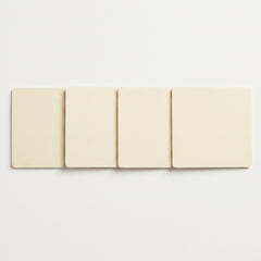
Rug Tape Gripper (4pcs)
FREE$59
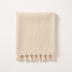
Turkish Towel
FREE$5
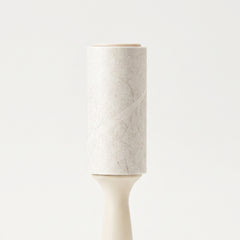
Pet Hair Remover
FREE$6
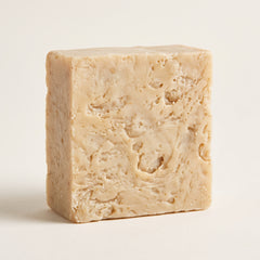
100% Handmade Natural Soap
FREE$59
Mystery Gift
FREE GIFT VALUEFREE$159
Prairie brings soft, painted color into your home. Denim blue washes over warm cream, quiet grey and a hint of gold, like a wide open field at sunset.
Product details
The distressed watercolor look feels modern and calm, and it hides the small messes of a busy day. Put it in the living room and the whole space feels finished. Put it in a bedroom and it is the first soft thing you step on in the morning.
Set it in a hallway or entry and it makes the walk into your home feel warm. The design is printed with high-quality digital printing, so the lines stay sharp and the colors stay rich and deep. It looks like real brushwork under your feet.
This rug works indoors and outdoors, so you can use it in the den, the kitchen, a covered porch or a patio where friends gather. Life with it is simple. It is machine washable and easy to clean, so spilled juice or muddy paws are a small moment, not a big one.
It does not shed and does not fuzz, so you get no dust or loose fibers on your floor. The surface is soft underfoot, and the non-slip backing helps it stay put when kids run across it. The 6mm low pile slides under doors without catching, and the durable overlocked edge keeps the whole rug neat for years.
Kind to pets, kind to kids, kind to your weekend.
Care
Small rugs If it fits in your washing machine, wash it there. Use cold water and a gentle cycle. Do not use bleach. Lay it flat to dry.
Big rugs A big rug will not fit in a machine. Vacuum it often. Wipe spills with a damp cloth, then blot it dry. Do not rub.
Shipping and returns
Orders arrive within 5 days by DHL Express or FedEx.
Return it within 30 days for a full refund. We pay the return shipping.
Wipes clean in seconds and scrunches small for the wash.
Soft but Durable
Our most versatile rug made for everyday living.
Designs You Will Not Find Anywhere Else
Every Rugzella design is drawn by us and exists nowhere else. We don't license artwork or resell others' patterns. This means the rug you choose is unique to you.
Safe for Pets and Children
All our rugs are antibacterial and antiallergenic. They are safe for homes with pets and kids. Ours is tested by us and the machine-woven range is confirmed by the mill that makes it.
Yes, It's Really Washable
Roll it out, and you're ready to go! This rug scrunches small and cleans easily. No complicated assembly needed.
Scrunch
Roll it up small. It folds down to almost nothing.
Wash
Into the machine on a cold, gentle cycle. No bleach.
Unroll
Lay it flat to dry, then put it back down.
Antibacterial certified
Antiallergenic certified
Non-slip backing
See it before you buy
Custom Size
Express Shipping
30-day free returns
Antibacterial certified
Antiallergenic certified
Non-slip backing
See it before you buy
Custom Size
Express Shipping
30-day free returns
30days
If you don't like it in 30 days we'll refund you every penny no questions asked
We pay the shipping and it's fine if you've used it
I was on the fence for days, but once it was down the layout makes sense now. The clean modern look does not compete with anything and the abstract detail keeps the eye moving. I would tell a friend to get one.
I am glad I went with the busier option. The room went from plain to interesting. The gold tones warm things up in the afternoon and the blended watercolor tones shift a little in different light.
I had an empty looking floor and this fixed it. It quietly upgraded the entire space. The modern styling suits the rest of my furniture and the modern design keeps the room feeling current. I have it in the bedroom and it works.
I like that it does not feel like everyone else's rug. The cream keeps everything light. This ended up in the entryway. Glad I stopped overthinking it.
I was pretty unsure about buying a rug online. Either way the furniture actually looks like it belongs together. The grey palette is easy to match, it works for the covered porch as well as inside, the watercolor blending looks soft rather than printed. Nothing I would change about it.
I kept going back and forth between this one and two others, but everything reads more polished now. The grey palette is easy to match, the watercolor fade gives it a lot of depth. The detail is nicer up close.
I have been looking for something in these tones for months. The space feels calmer with it down. The gold tones warm things up in the afternoon. It suits the space more than I expected.
I was unsure whether the style was too bold for me, but the room has a lot more depth to it. The cream base makes the room feel bigger. It is in my dining room now.
I wanted something soft underfoot in that spot. The furniture finally has something holding it together. The abstract layout means there is no wrong direction for it, the grey palette is easy to match. I moved it into the hallway and it fits. Room feels different in a good way.
I nearly closed the tab three separate times, though the room has a lot more depth to it. The cool blues are restful to look at and the abstract design gives the floor some movement. Really pleased with how it turned out.
I picked this for the color and stayed for the pattern. The room feels softer overall. The cool blues are restful to look at, it works for the covered porch as well as inside.
I expected the design to look flatter than the pictures, but it filled the gap I could not name before. The modern styling suits the rest of my furniture and the cool blues are restful to look at. I have it in the family room and it works.
I have been looking for something in these tones for months. The blended watercolor tones shift a little in different light, the blue tones keep the room feeling calm.
I was skeptical that the shade would match anything I already own, though the room stopped feeling like a rental. The modern styling suits the rest of my furniture, the cream keeps everything light, the watercolor blending looks soft rather than printed.
I think this pulled the whole layout together. The space finally feels done. Being washable takes the stress out of a high traffic spot and the washed watercolor effect is subtle in person. It is in my den now.
I was worried the pattern would be way busier than it looked. Turns out it filled the gap I could not name before. This ended up in the reading corner.
I was after a specific look and this landed close to it. Everything looks a lot more pulled together now. The indoor outdoor option gave me more places to use it, the gold tones warm things up in the afternoon. Soft enough for sitting on the floor.
I was concerned it would overwhelm the space, and honestly the room stopped feeling like a rental. The cream base makes the room feel bigger and the modern design keeps the room feeling current. I moved it into the living room and it fits. Everyone who comes over notices it.
I doubted the whole thing would come together. In the end the floor no longer looks like an afterthought. The gold tones warm things up in the afternoon.
I unrolled this and immediately liked where it was going. The floor no longer looks like an afterthought. The gold tones warm things up in the afternoon, the abstract layout means there is no wrong direction for it, the abstract design gives the floor some movement.
I hesitated because the pattern seemed like a lot, but once it was down the furniture actually looks like it belongs together. The cream keeps everything light, it works for the covered porch as well as inside, the watercolor blending looks soft rather than printed.
I needed something with more personality than a solid. The room feels more complete than it has in years. The abstract design gives the floor some movement.
I honestly expected the colors to look washed out in person, though it added the warmth the space was missing. The washed watercolor effect is subtle in person and the cream base makes the room feel bigger.
I expected to be a little let down, honestly. Either way the whole area feels more comfortable. The indoor outdoor option gave me more places to use it, the cream keeps everything light. Happy with the call.
I have been looking for something in these tones for months. The clean modern look does not compete with anything, the gold tones warm things up in the afternoon. No complaints so far.
I think the pattern hides everyday mess well. The seating area feels defined now. The washable part is what sold me with a dog in the house, the grey palette is easy to match.
I almost didn't order this because I can never tell scale from a screen. Turns out the room feels more complete than it has in years. The washed watercolor effect is subtle in person and the gold tones warm things up in the afternoon.
I had an empty looking floor and this fixed it. The gold tones warm things up in the afternoon, the indoor outdoor option gave me more places to use it.
I like the balance between pattern and open area. It made a plain space feel considered. The watercolor blending looks soft rather than printed. It suits the space more than I expected.
I ended up moving it to a different room and it works there too. It took the space from fine to actually nice. The washed watercolor effect is subtle in person and the gold tones warm things up in the afternoon. I have it in the den and it works.
I appreciate that the design does not feel generic. It made the space feel lived in. The washed watercolor effect is subtle in person, the grey palette is easy to match, the washable part is what sold me with a dog in the house. It is in my den now.
I have a lot of neutrals going on and this gave them a center. The furniture finally has something holding it together. The modern styling suits the rest of my furniture, the washed watercolor effect is subtle in person, the grey palette is easy to match.
I kept going back and forth between this one and two others, though it filled the gap I could not name before. The abstract layout means there is no wrong direction for it, the cream keeps everything light. I moved it into the reading corner and it fits.
I finally found something that works with what I already had. It was the finishing touch the room needed. The modern design keeps the room feeling current and the gold tones warm things up in the afternoon.